|
|
Post by Celestic on Feb 22, 2010 2:07:24 GMT -5
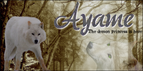
Hey guys! What do you think of Aelyn's new look? Give us your opinions, and vote in the poll. If you vote, be sure to post a reason as to why you made your selection!
Aelyn Staff
|
|
|
|
Post by nogardifer on Feb 22, 2010 2:36:16 GMT -5
xP First to vote on the poll. I must say, the new layout is friggen amazing, I just prefer the blander one we had before, less distraction while posting  Nothing against the new layout, just not for me  |
|
|
|
Post by Celestic on Feb 22, 2010 2:59:50 GMT -5
I like both of them, but I prefer the new one. It's always good to have some change and I like the darker colors along with the blues. |
|
|
|
Post by ˟ PunkWolf on Feb 22, 2010 3:10:34 GMT -5
And if the blue font's too much for you, there's always the second skin!
|
|
|
|
Post by nogardifer on Feb 22, 2010 3:12:32 GMT -5
Haha yeah, i was just looking through it now and figured out how to change it. I take back what I said earlier, this new layouts just plain badass Nice work |
|
|
|
Post by Memory on Feb 22, 2010 5:10:44 GMT -5
Na i like the blue writing... but i know my charrie Toboe uses the blue for talking... will it make a differeance =/ Loving the new skin! Makes the site have the wow factor |
|
|
|
Post by - [s][w][a][y] - on Feb 22, 2010 5:12:48 GMT -5
I don't think blue writing will be an issue. You bold your speech as well, don't you? |
|
|
|
Post by Imaginatio on Feb 22, 2010 9:11:24 GMT -5
This is simply dazzling, I'm offsite for a day and this happens! Woah....all I have to check for it to be the icing on the cake is....
Purple writing of doom?
PURPLE WRITING  Reason for Editing: To check the purple writing xD Reason for Editing: To check the purple writing xD
|
|
|
|
Post by Memory on Feb 22, 2010 11:33:57 GMT -5
Emm no... i italic it when they are thinking... ill probarly bold it to make it less confusing |
|
|
|
Post by nogardifer on Feb 22, 2010 11:42:58 GMT -5
I'll still see the blue I have the font set on gray. |
|
|
|
Post by Cinder on Feb 22, 2010 11:54:33 GMT -5
I do like the new skin, I prefer the old one though, it was more complex, but simple. I liked the colors, and I like the black background for text on this one, it makes it so you can have any color text, but I liked the lightness of the old one, the dark is kind of hard for me to see. I haven't checked out the other one yet, so I'm going to do that now then edit this post.
**********************************
I have to say the blue on the black like that, everywhere, burns my retnas. (sp) I really don't like the blue, so I suppose I will have to use the gray...
Another thing that I don't like is the forum moderator color...the yelowy white thing -nose wrinkle- not my choice....and I'm probably the only one who even notices it, cause I'm the only fourm mod, but it just seems like the BLANDEST color on the forum... It depresses me, and I miss the orange..
Reason for Editing: Add ons!
|
|
|
|
Post by nogardifer on Feb 22, 2010 12:01:06 GMT -5
xD I was thinking the same thing cinder. Just like O.o what happened to that smexy orange?
|
|
|
|
Post by darklight on Feb 22, 2010 14:28:44 GMT -5
I must admit that this one is much more appealing. Though the constant bright blue on the black is too much contrast for my taste, the gray works brilliantly. I find that the black and the grays give members more creativity, and more oppurtunity in order to experiement with character colors for speech and thought and general in roleplay, and not have to be concerned about it not mixing with any off color of purple. And I do admire the background very much. Much better than odd, hawian flowers, which did not match the site at all. There was not even a tropical packland or such. The flower background never did fit.
The only thing that I can think be modified is the gray shade of the text. It appears fine on my FireFox browser, but when I use Internet Explorer (that terrible one that I never use) the blue as the 'secondary background' appears nearly black and the gray color of the text could be a small bit brighter. I know that you cannot please everyone with how many different browsers there are out there (and if I look not very members use pathetic Internet Explorer) but I just felt like comparing and sharing the results with you.
Thank you Sway, for the beautiful skin.
|
|
|
|
Post by ĢoτђikaFøx on Feb 22, 2010 16:35:15 GMT -5
Hard to say XD
I like the old Pack pictures (the tiny pics that was in the background of the Pack name)
and the style of the ranks in each Pack (on the left, all close together)
but at the same time I really really love this new skin design and both colour options but at the same time I miss the old ones.
Having all four might be an idea for those who prefered them, that way no one gets left out.
But unltimately I Love The Skin(s)! They're gorgeous in both colour scheme and art ^^
Great job!! xxx
|
|
|
|
Post by Cinder on Feb 22, 2010 18:37:59 GMT -5
I know it Drake xD That orange was HAWT
|
|
|
|
Post by - [s][w][a][y] - on Feb 22, 2010 19:01:26 GMT -5
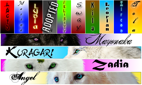
I wanted to organize the staff colors into groups, which is why it was changed.
We have intentions of bringing in more colors, so never fear... as we come up with more, we'll be sure to let everyone know. There will probably be more variations of blue, some green, as well as some other colors.
THere are still some minor tweaks going on as well, so any input you might have is more than welcome! I always love to know ways that I might be able to improve or please the members.
As for bringing back the others, we wouldn't be able to do that because images wouldn't match, though we could take suggestions for font colors and link colors (Not any images) that you might like to see? They might clash, but as long as the members are okay with it, I see no issue with that.
So any and all suggestions or requests are welcome here, just remember that we cannot change the images with each skin, so if you do come up with something you'd like to see, keep that in mind.
|
|
|
|
Post by Cinder on Feb 22, 2010 19:03:54 GMT -5
For the moderators, could it be shades of green, rather than yellow, and change the tech support to blue. The tech support like cerulean, and the forum mod- LIME GREEN, and the other mods different shades of green?
I just think Yellow for one, clashes, and it is the blandest color...
|
|
|
|
Post by Celestic on Feb 22, 2010 20:00:57 GMT -5
In regard to the staff colors I have no problem with what color they are, I just think we need to bring back the "bolded colors" it makes the staff stand out a bit more---Plus I think it looks nice as well.
|
|
|
|
Post by - [s][w][a][y] - on Feb 22, 2010 20:17:59 GMT -5
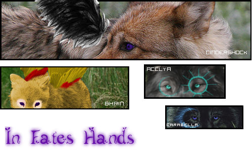
Another new skin created.... Misuteriasu Mountains! THe other packlands are in the works, never fear! As for changing staff colors... lets leave that in the staff discussion You really can't please everyone. |
|
|
|
Post by Celestic on Feb 22, 2010 23:07:06 GMT -5
And besides that something the staff should discuss. XD
|
|


 Nothing against the new layout, just not for me