|
|
Post by jessare on Feb 26, 2010 20:39:02 GMT -5
Personally, I think the whole thing just clashes...a lot. =/
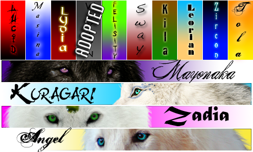
The stars in the background are a bit much, I prefer simpler backgrounds. And then the different stars in the side bars and the chat box area...again, too much and it all just clashes, for me at least. The colors could work much better together...but to be quite honest, it feels like this was almost thrown together in a matter of minutes as opposed to actually working on it. =/ And then the banner, I feel like the two wolves on the sides, with the green, just popped up out of nowhere. So, personally I don't really like this skin. I'm not straight out saying it's horrid, but I feel like it definitely had some potential that wasn't reached, and that someone tried much to hard to make it good...overall, it just clashes a lot. =/ |
|
|
|
Post by - [s][w][a][y] - on Feb 26, 2010 21:59:29 GMT -5
I appreciate your opinions  I'm currently working on some tweaks and whatnot to make things a bit better and a bit smoother. I'm working on a few new codes and whatnot that should make things look a lot better. |
|
|
|
Post by Celestic on Feb 26, 2010 23:21:22 GMT -5
Don't forget, we have other skins too.
|
|
|
|
Post by jessare on Feb 27, 2010 0:22:42 GMT -5
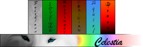
I've actually looked at the other skins, but ummmm...the different backgrounds and slight color changes actually make them clash even more. Personally, I like the skin before we had these better, simple, effective, and pleasing to the eye. x] Right now the best one I can see is Ice...and even then, as I stated in my last post, I feel that it clashes a good bit. |
|
|
|
Post by Celestic on Feb 27, 2010 1:34:58 GMT -5
Slight color changes? Compared to the default they are definite color changes. Currently I'm using the Nigori Marshland skin, and it is a lot easier to read than the others. IMO. The last one actually hurt my eyes a lot...but I guess every skin has its flaws.
|
|