|
|
Post by - [s][w][a][y] - on Mar 14, 2009 19:36:19 GMT -5
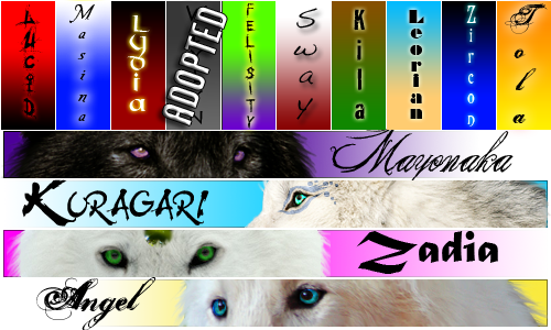
Well, the lovely and amazing Kerrigan has once again set us up with a new layout... What does everyone think? Opinions, suggestions, comments, etc are more than welcome! This is YOUR forum and in order to make the general majority happy, it needs YOUR opinions!
|
|
|
|
Post by ˟ PunkWolf on Mar 14, 2009 21:32:17 GMT -5
- good use of colors, great background, syncs up very nice----but the color of tan for the forum would look much nicer if the corners of every dialogue/post table were rounded instead of pointed
- the new pictures for the labels (chatbox/staff/weather/ect.ect.) look great with the different angles of birds---however, this is a wolf based role play, the images are great, but maybe use a bird shadow for one, a deer shadow for the other, a bobcat shadow for another, use different animals from the forest, ones that might also be in the lands
- ok, my favorite part is the information of the pack lands that’s located on the left, the pictures are awesome, very creative and such---only that whenever a new wolf claims a land or one steps down, the pictures must be removed and another must be created, might be a little time consuming is all I’m saying
- the new font for the tables on the left is great, has personality and art to it—but it makes the boxes extremely big and pulls the page down A LOT, it’s a tad annoying on small pages but for really long role plays that have itty-bitty scroll bars, this is extremely good cause it fills up the page nicely
- the blue mountain dividers are nice—but kinda don’t match the tan layout
- the blue and red link colors stand out badly, maybe black/white or gray/white or even tan/dark tan
|
|
|
|
Post by Celestic on Mar 15, 2009 13:55:07 GMT -5
I actually adore the new layout babe! OMG especially the banner, it is orgasmolicious! =]
|
|
|
|
Post by Imaginatio on Mar 16, 2009 7:09:26 GMT -5
This is really nice, Loving the info on the packs as well! All this is so amazing, and it makes the site look great too! Anyone coming here would be impressed, so i think this is great! *huggles her moderator band* <333 BUUUT I have to say...I'm gonna miss the awesome purple writing, and although yes it did look very dark and the page now looks a lot brighter and exciting, I will also miss the dark previous layout xDD *loves purple* BUT this is AWESOME! I also agree with Punk about the birds...but I'm not sure what to change them to though  |
|
|
|
Post by Celestic on Mar 16, 2009 9:44:07 GMT -5
^I completely agree, I will miss the purple too.
The only thing I have against this new set up is how the teal font color looks SO crappy when compared to the background lol.
Sahra and I were talking about that yesterday when we were experimenting with it. XD
|
|
|
|
Post by kerrigan on Mar 16, 2009 16:03:59 GMT -5
[/b], I did change the header images for the side tables to different animals. My computer has a very low memory, and the birds brush was all I had at the time. I put a bunch of animal shadows on my laptop just for this suggestion, which I don't usually do. And I made the wolf one ( if you can tell it's a wolf -.-" ) for the first one. Two, I changed the link color for Punkwolf to white. The blue was to fit in with the background in the logo and the background in the category picture.[/blockquote] That's all I fixed and I'll tell Punkeh why. lol Thanks for the comments Punk, but do ya think you analyzed a little much? xD One, my computer hates and fails at transparent images, which the curved corners would have be to work. So I thought about it, tried it, failed compeltely, and decided to just make it smooth as possible. Sorry, Punk, but it's just not something I can do.
Two, the pictures are their for decoration, and to make sure that the positions open are apparent and straight forward. Yes, they're on the board, but I think the side tables stand out more. Also, when someone steps down/is replaced don't you have to remove the name from the regular boards and the pack information inside that pack land as well? So, it's the same amount of time in my opinion, if we remove the pack stats from the boards, but that's Sway's area. >P And I think they is pretty. -shrugs-
Three, that stretching problem will happen anyway I do it, whether the stuff is written or made into a graphic. ( actually it made it shorter, I checked ). So that's kinda hard to get rid of unless someone wants to remove a few tables, which will make little difference. And, I did try to make all the graphics like the Aelyn intro in the first table shorter with the scroll. I don't know how to change that without taking something out, which I don't want to do.
Four, The moutnain dividers do match the tan. In a weird way they do match the background color, and it's just to add a splash of color too. It would get kinda boring to have just tans, true? Okay, to Imaginatio&&.Celestic: Sorry about the purple being gone, but the skin was old and the site needed a change. I can't stick purple in this skin because it would stand out too much, but I'll try and fit it into the next one for y'all. ^^ Also, thanks for liking my purple skin. lol It's nice to watch y'all enjoy the skins I make. ^^ [/ul][/size][/color][/blockquote] |
|
|
|
Post by ˟ PunkWolf on Mar 16, 2009 23:23:45 GMT -5
Sorry, wasn't trying to pick your lovely layout apart piece by piece and devour its soul through a painstakingly slow process, i was just giving suggestions ;] Don't get me wrong at all, it's absolutely amazing, you've got skill, kudos to that, you asked for input and i gave it, like i said before...i know making skins takes time, practice, dedication, and a little boredom, WAY beyond what i could ever do, trust me. I didn't post all my suggestions expecting you to DO THEM AND DO THEM NOW OR SUFFER THE CONSEQUENCES!!! ...no, no not that, i was just throwing ideas out there.
And you don't have to explain yourself either xP you owe me nothing ;] And as for the mountain dividers, i had to fix the color settings on my puter and restart it in order to see what you meant. Before they looked totally neon and way too much contrast x_o It really didn't look good... I do appreciate the change of red/blue links into white, much more easier on my wee-wee cyclopes eyes o)
Next time you don't like my constructive criticism, tell me to shove it...
^^ then I'll ask you to help.
|
|
|
|
Post by kerrigan on Mar 17, 2009 19:09:52 GMT -5
|
|
|
|
Post by Nynx on Mar 19, 2009 18:29:11 GMT -5
I miss the old layout. If there a way to have option's on what layout you want?
I like it though...
I feel so out of place here...
|
|
|
|
Post by pokeapache on Mar 20, 2009 5:53:30 GMT -5
To be honest, I normally and naturally prefer dark skins.
however, I am OBSESSED with brown+blue. Congrats xD I just got some dark brown + blue shoes last night.
... <: I was a bit miffed at how bland the Moderator color looked, but with the normal members and links being white and less stand-out special-looking then I like it. ^___^ So yeah, good skin. ^^
|
|
sphinx
Subordinate
 [M0n:100]
Toko Forest Alpha
[M0n:100]
Toko Forest Alpha
Posts: 79
|
Post by sphinx on May 10, 2009 15:09:33 GMT -5
I like the new layout, the only thing that i could see that needs to change in my opinion is the fonts need to be darker then the background for the links. But other then that, the new layout was very nicely done.
Sphinx has returned.
|
|
|
|
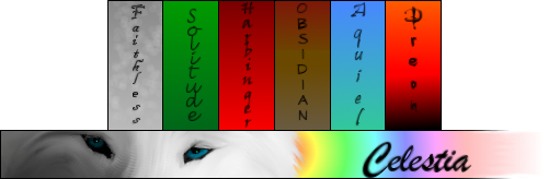
Post by Celestic on May 15, 2009 15:19:17 GMT -5
I'm relatively satisfied with the background/layout we have now. We change it so often. lol
|
|